This page contains slightly later works foe color study.
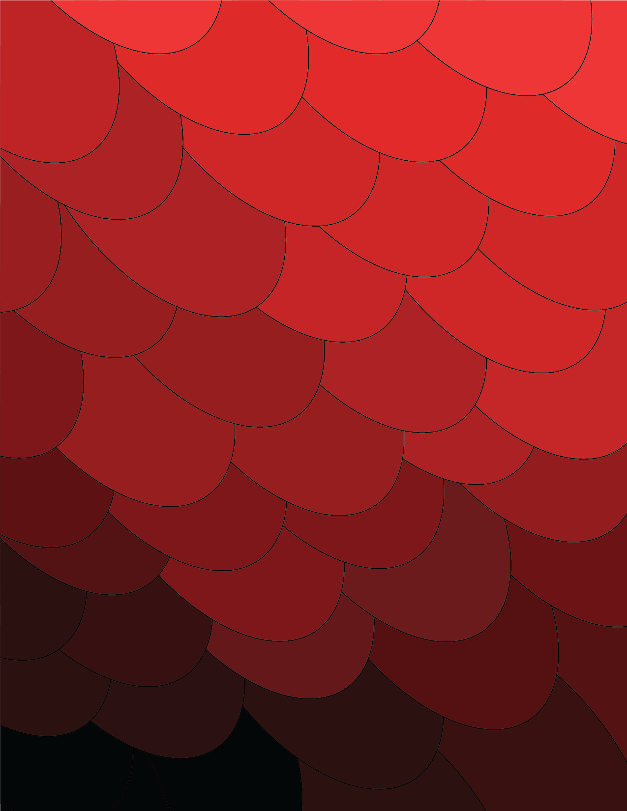
For this project we experimented with the brightness of a singular color and how that brightness effects the way the color is perieved. I decieded to go with the color red, and do a pattern that waws like scales that way it would be easier to layer.
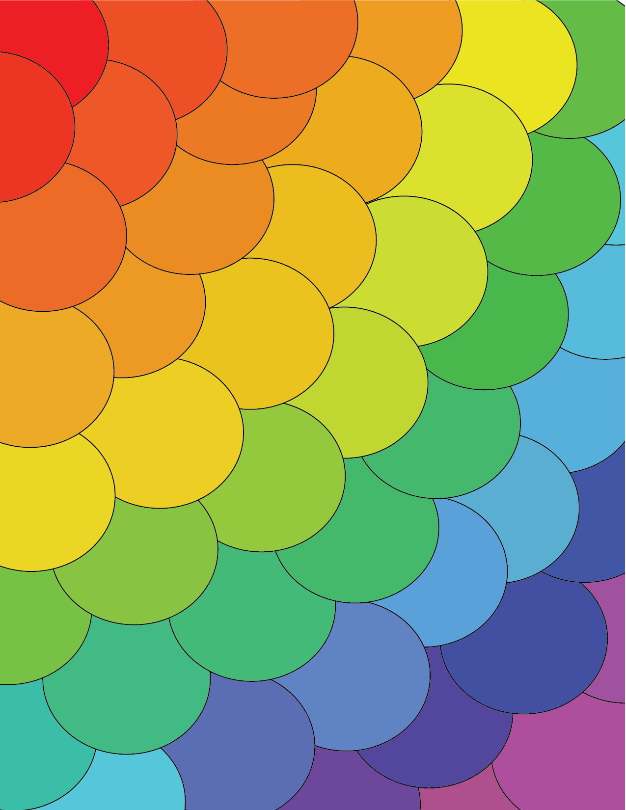
For this project we used every color of the rainbow to study the hues or each color and tried to have them blend into one another smoothly.
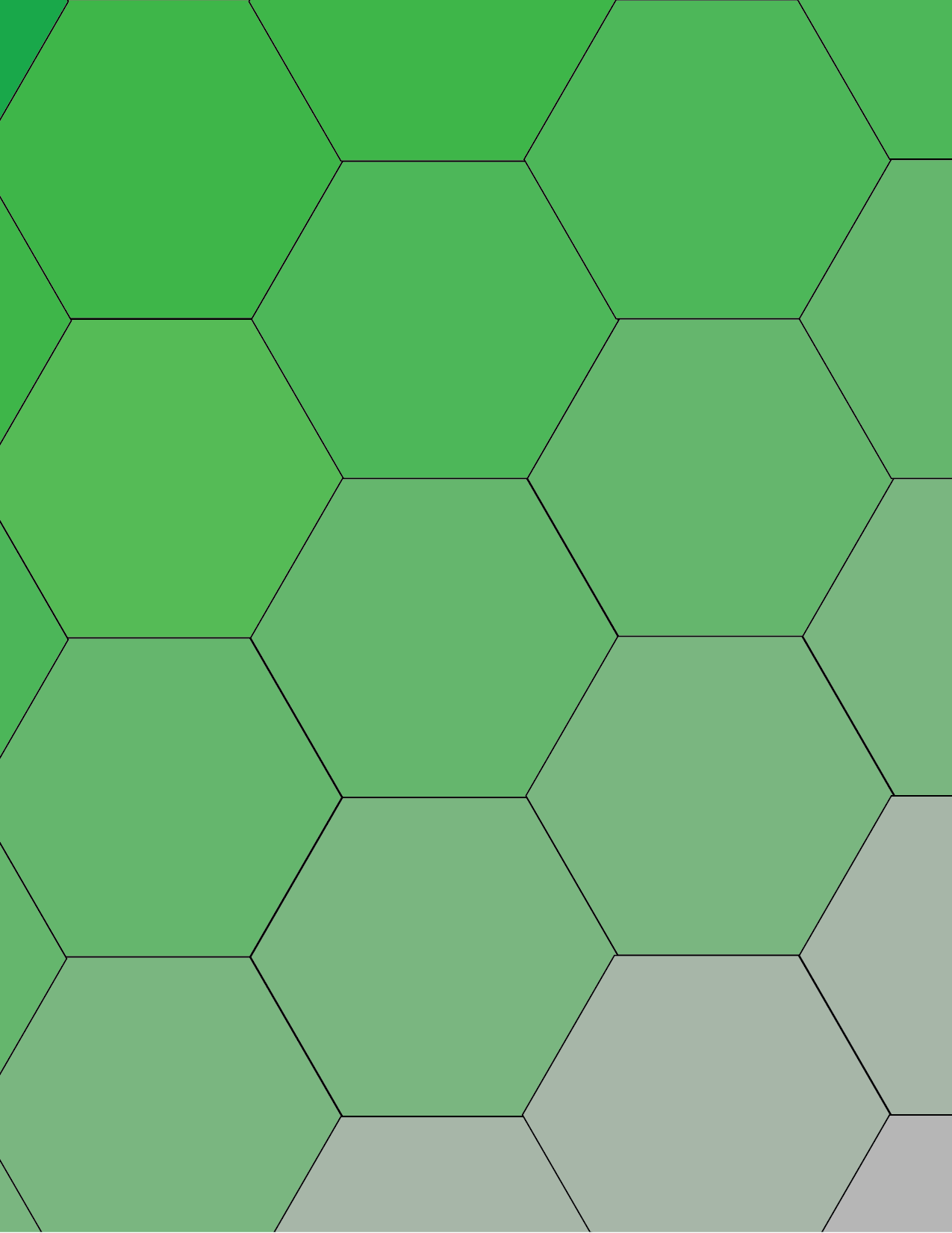
For this project we picked one color and began to take away the saturation of the color throughout the piece.
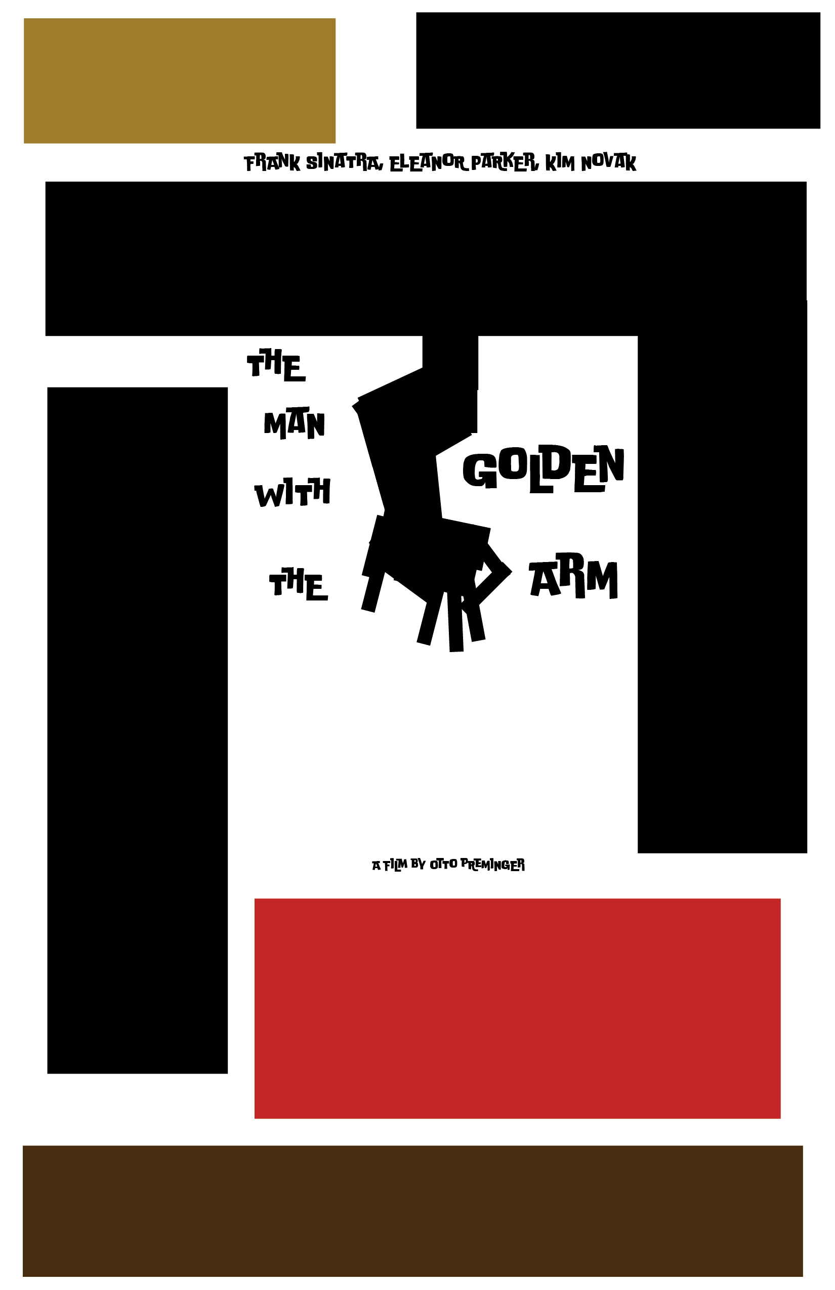
For this project we were assigned a movie poster that we had to copy and we had to pick Analogous colors.
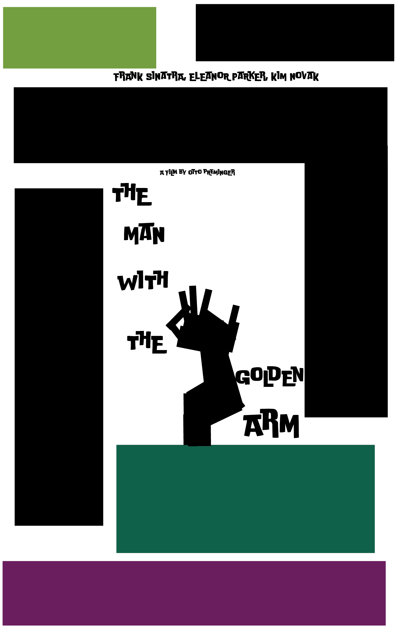
For this project we used the same poster but found tetradic colors and arranged them.
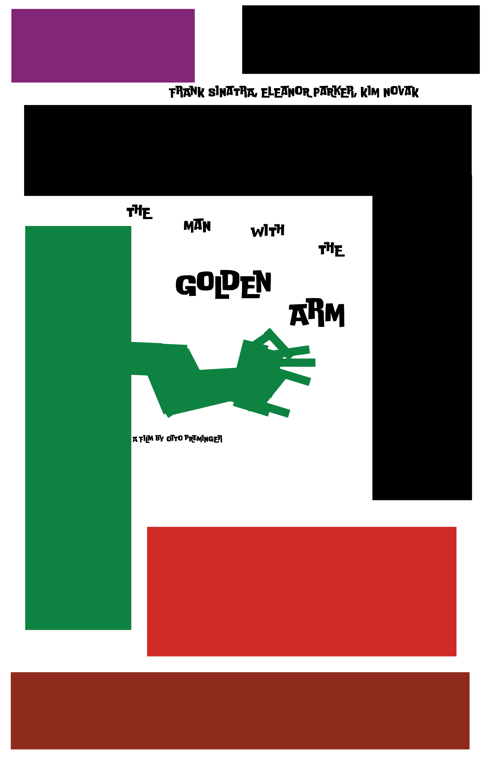
For this project we used the same poster but found Triadic colors and arranged them.
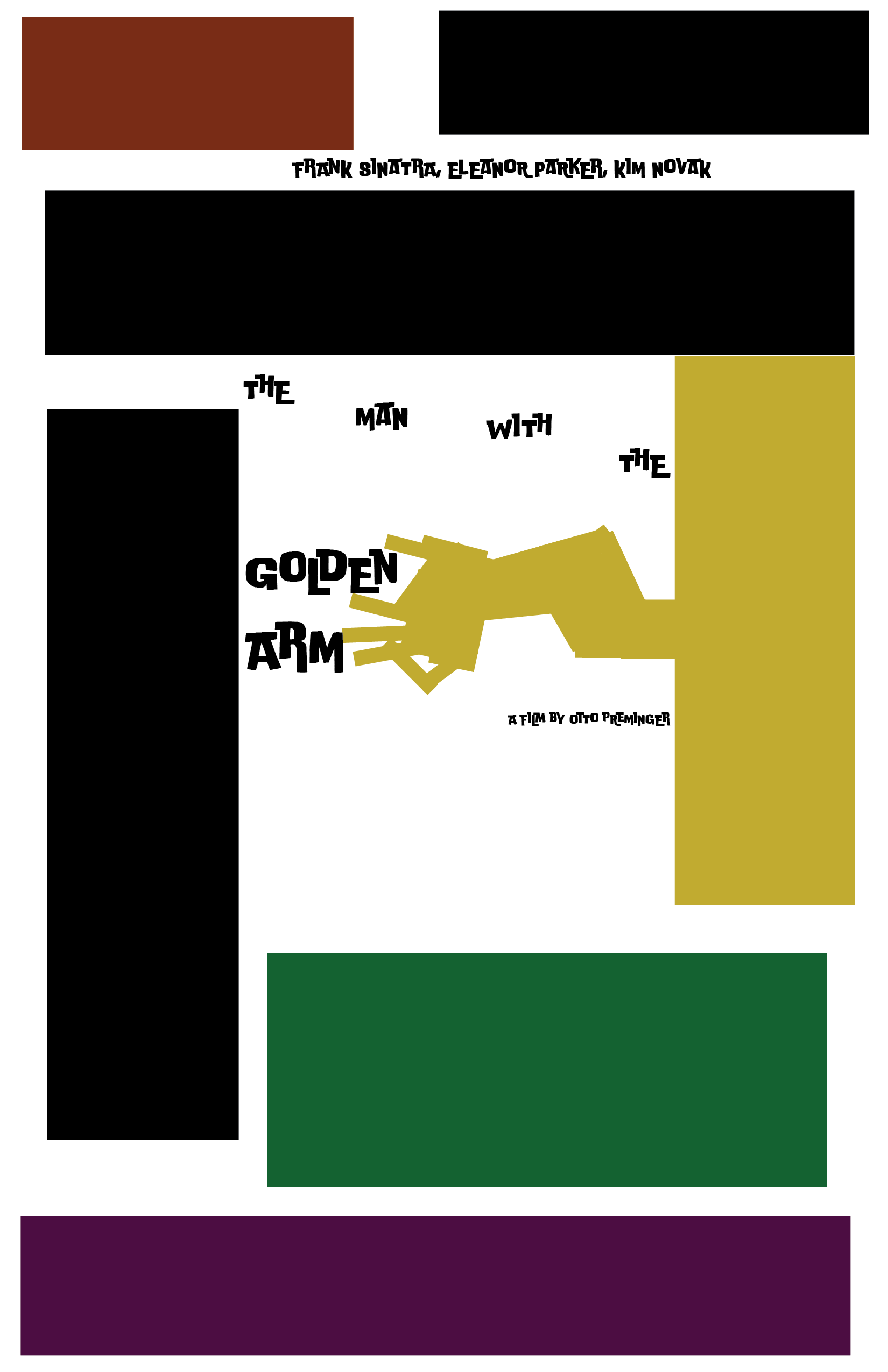
For this project we used the same poster but found Split Analogous colors and arranged them.
Click here to see projects with Transparency and Layers! Click here to return to previous Color Studies Click here to return to the index!