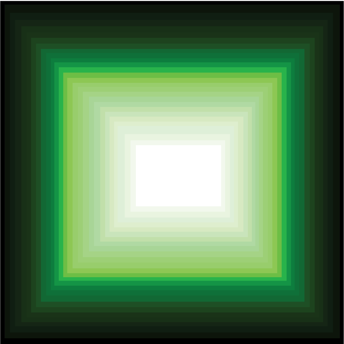
For this project we studied the brightness of colors and how it affects the way it is percieved. I made this by messing with the saturation of each rectangle and layered them ontop of one another.
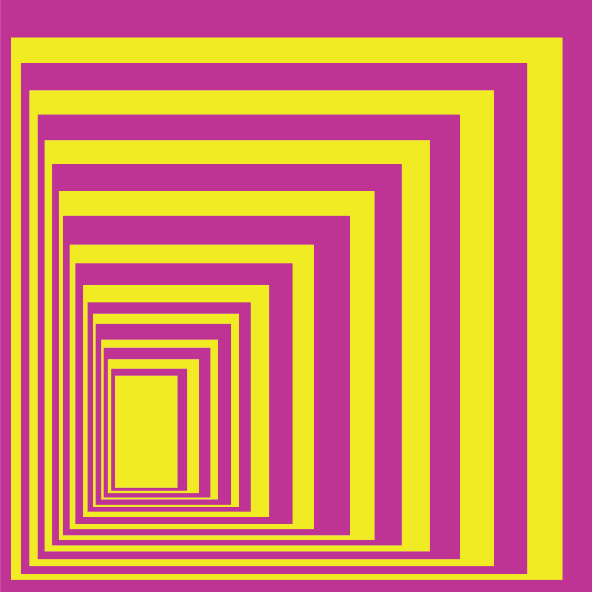
For this project we tried to simulare movement through color. I chose two colors that contrasted each other to helo the composition stand out and confuse the eye into thinking that the piece was moving either towards the viewer or away.
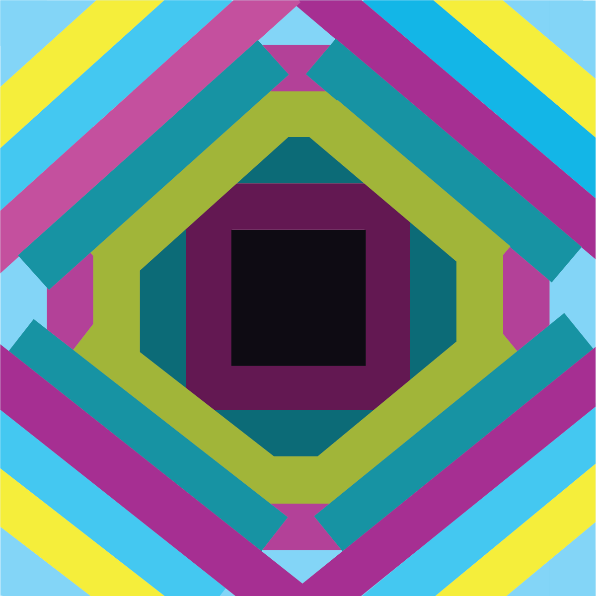
For this project, we used three different colors to attempt to show depth and movement in a 2D environment. I used three colors that seemed to compliment each other well and then played with the placement and the brightness of each color.

For this project we took four colors and tried to find a background color that made them look completely different.
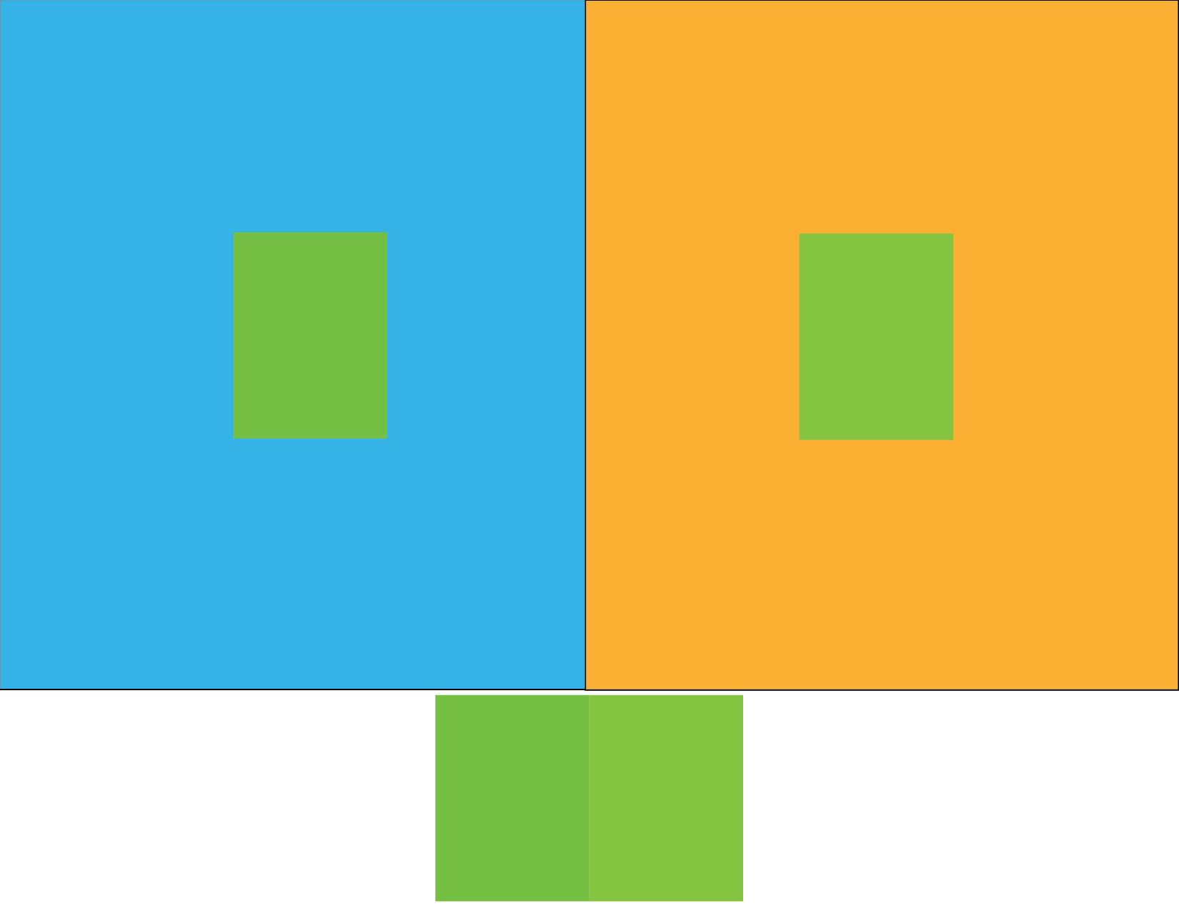
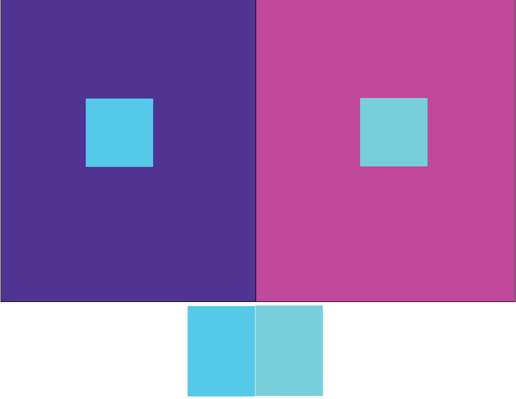
For this project we chose four colors and tried to find the backgrounds that made the two colors appear the same to the human eye even though they are different.
Click here to see projects with Transparency and Layers! Click here to see more Color Study! Click here to return to the index!